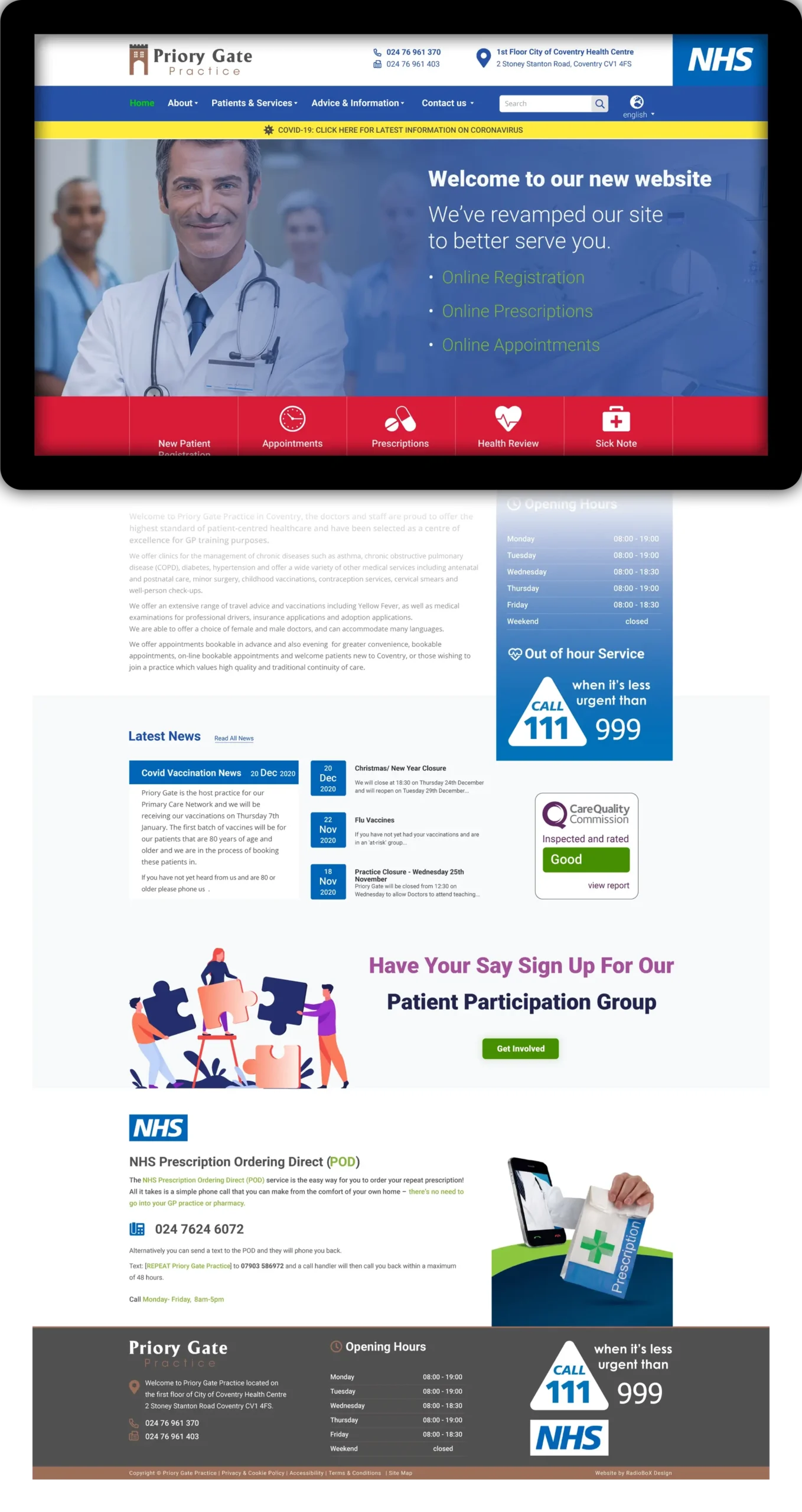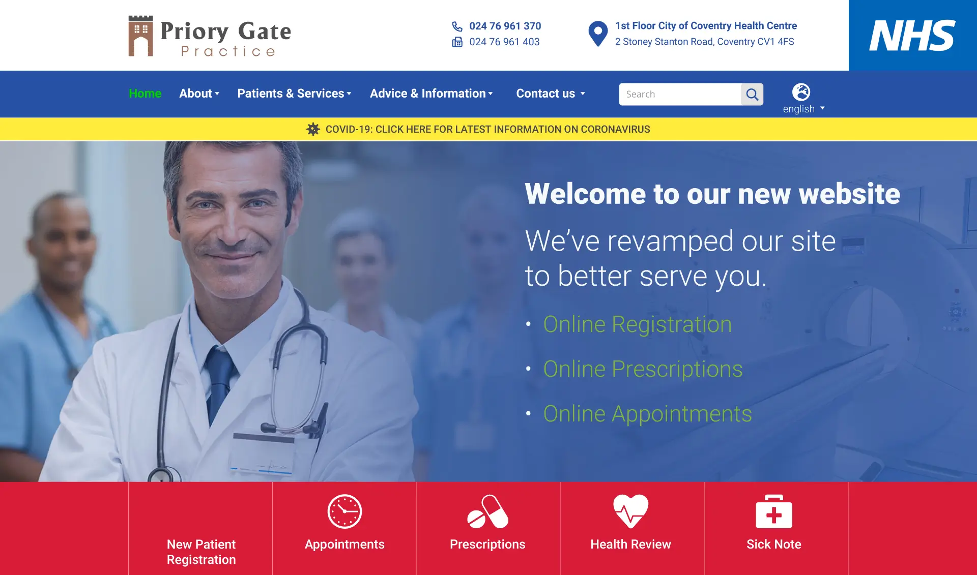
I worked with an NHS GP Practice to redesign their website and create a cohesive brand identity, including a new logo. Their existing website lacked usability and sufficient information for patients, limiting its effectiveness as a signposting platform. The goal was to create a user-friendly, information-rich website that could serve patients of all ages and demographics, including those for whom English is not a first language.
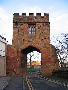
Logo mark inspired by the Coventry Priory gate landmark

Challenges
- Accessibility: Designing a platform accessible to a wide range of users with varying language proficiencies and technical abilities.
- Information Overhaul: Presenting extensive information in an organized, digestible manner to address patient needs.
- Brand Identity: Establishing a recognizable and approachable identity for a practice that previously lacked a logo.
Solutions
- Logo Design: Developed a unique logo inspired by the priory gate landmark. This emblem not only connected the practice to its local heritage but also conveyed trust and professionalism through clean, modern design.
- Website UI/UX Design:
- User-Friendly Navigation: Developed an intuitive layout with clear menus and links to ensure ease of use for all visitors.
- Information Hierarchy: Organized content logically, prioritizing essential patient resources and services.
- Accessibility Features: Ensured usability for diverse demographics with clear typography, responsive layouts, and straightforward calls to action.
- Resource Hub: Integrated numerous links and signposting features to external health-related resources.
- Research and Collaboration: Worked closely with the practice to understand their requirements through detailed questionnaires, ensuring the final design met their goals and addressed their pain points.