The Nigerian Railway Corporation (NRC) has been a symbol of connectivity and progress for decades. However, its original logo no longer reflects the organization’s modern aspirations. The design is dated, cluttered with excessive information, and hindered by a poor layout. The use of tiny text and a three-line name lockup further compromised its legibility and impact across applications.
The Problem
Prospective students in Nigeria face several challenges in accessing accurate and up-to-date information about higher education institutions, courses, and admission requirements. These challenges often lead to poor decision-making and missed opportunities for candidates. NUCIS was designed to address these pain points by centralizing higher education information and making it accessible, understandable, and actionable for students and parents alike.
Some of the challenges identified during the discovery phase included:
The logo’s design elements lacked cohesion and failed to convey a contemporary image.
The text-heavy layout and small font size reduced clarity and adaptability, especially in digital formats.
The three-line lockup with the corporation’s name made it impractical for consistent branding across mediums.
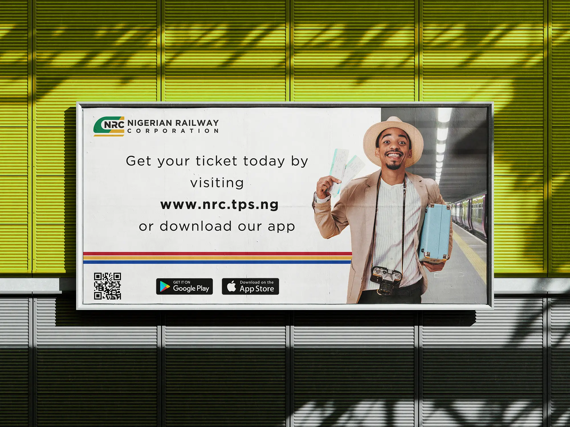
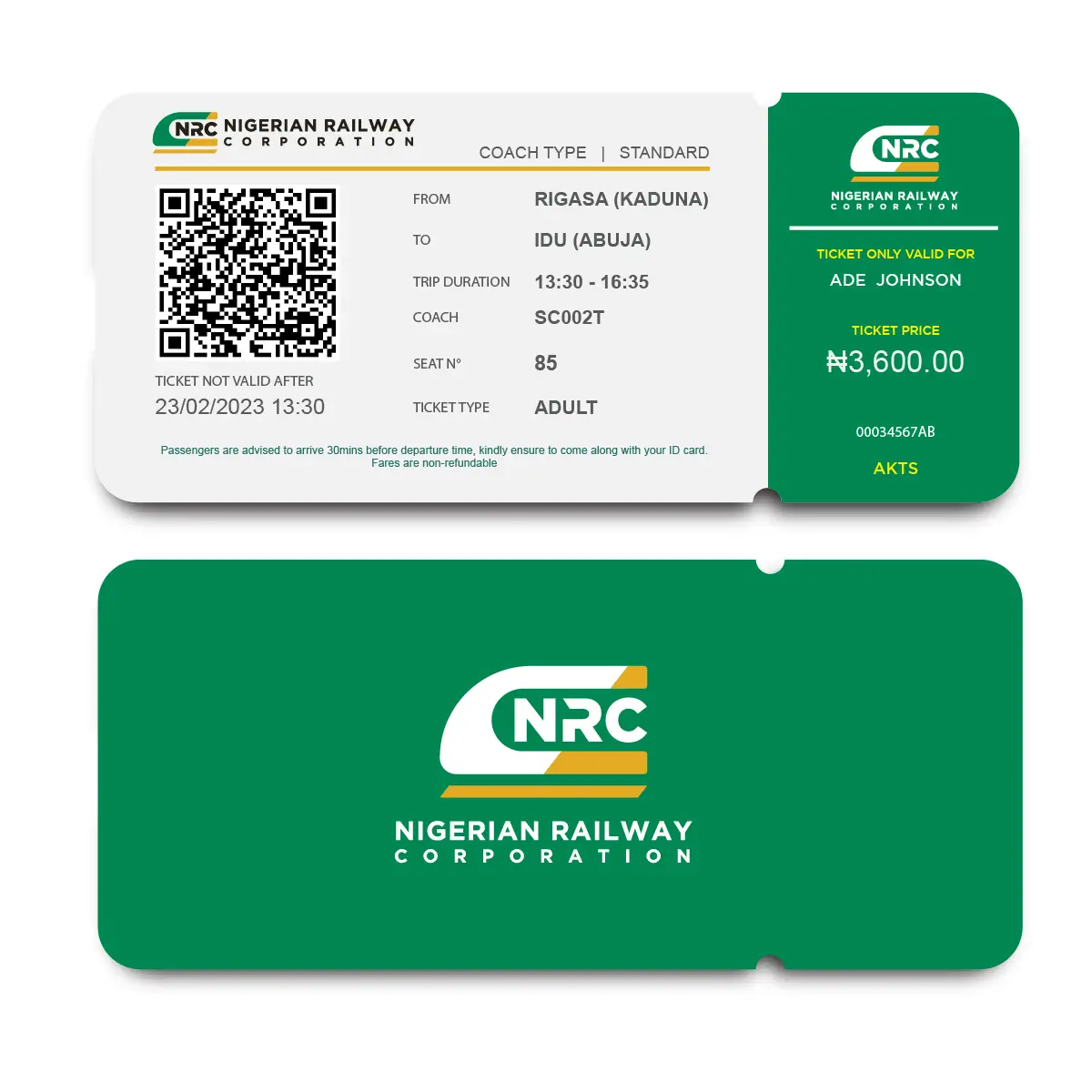
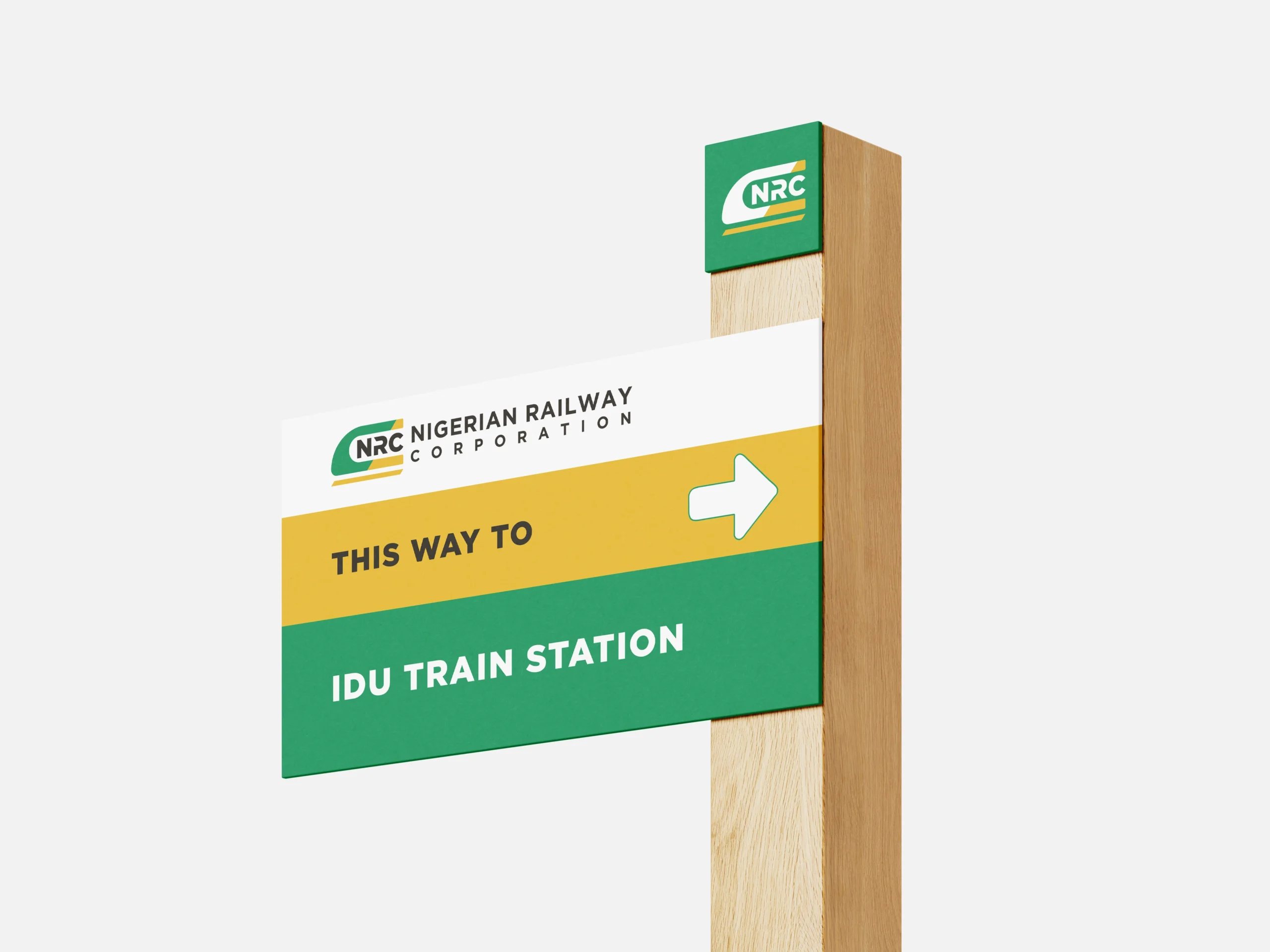
Solutions
The redesign focused on creating a clean, modern, and versatile logo that would:
Simplify and modernize the design to reflect NRC’s evolving identity.
Improve legibility and scalability by refining text elements and reducing unnecessary details.
Establish a cohesive brand lockup with a streamlined, dual-line presentation of the name.
Utilize national brand colors that can be found on the Nigerian coat-of-arms to establish a color palette.